zoomer
Well-Known Member
My theory (I used to make part of my living working with type): Since it's not a 3-D object or an insignia, they're not used to paying attention. If they had to do (say) exact embroidery label repops, they'd think differently. Unless they were Eastman.I think the font is off with pretty much all the repros Carl. It's funny as it shouldn't be a hard thing to do correctly.
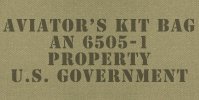
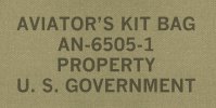
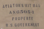
Here are some examples that turn up in just a few minutes' GIS. Originally some bags were stenciled, some stamped. Were any silkscreened? Nowadays they are.
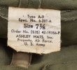
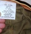
Originals - far right with Railway Express tag
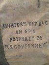
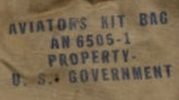
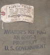
High-end J-repro - stencil is dead-on
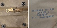
Other repros - very good to so-so (Eastman, center, could do better)
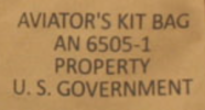
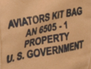
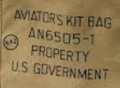
Soldier of Fortune - good bag, lousy stencil
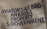
(looks like the titles used on Happy Days)
Last edited:

