-
When you click on links to various merchants on this site and make a purchase, this can result in this site earning a commission. Affiliate programs and affiliations include, but are not limited to, the eBay Partner Network.
You are using an out of date browser. It may not display this or other websites correctly.
You should upgrade or use an alternative browser.
You should upgrade or use an alternative browser.
The Goldsmith A-2 By Headwind Mfg Co
- Thread starter Skyhawk
- Start date
Skyhawk
Well-Known Member
It could that the left pocket is smaller than standard size A2 pockets.
Yes I think what we have is a pocket slightly bigger than an A1 on the left side, and an average a-2 sized pocket with a pen slot on the right.
zoomer
Well-Known Member
Could be...or it could be 2 equally sized pockets with a pen slot in one (like on A-1s)!
"Had that been me" (as Keenan Thompson says), I'd've taken small cues from existing A-1s where clear visual info was lacking. Like the layout of the spec label. (I forget Jay...did you layout the label in bold yellow after an existing label from a Goldsmith product?)
"Had that been me" (as Keenan Thompson says), I'd've taken small cues from existing A-1s where clear visual info was lacking. Like the layout of the spec label. (I forget Jay...did you layout the label in bold yellow after an existing label from a Goldsmith product?)
Skyhawk
Well-Known Member
Could be...or it could be 2 equally sized pockets with a pen slot in one (like on A-1s)!
"Had that been me" (as Keenan Thompson says), I'd've taken small cues from existing A-1s where clear visual info was lacking. Like the layout of the spec label. (I forget Jay...did you layout the label in bold yellow after an existing label from a Goldsmith product?)
I originally thought that the pockets were the same size, after more study I am leaning towards a wider pocket on the right. These are composite photos of the same jacket. The right pocket looks wider and more rectangular. Look at the pockets compared with the width of arms of the jacket :
Skyhawk
Well-Known Member
The Spec label follows the SAT example. It is a good chance it would be similar as the government provided the labels to both of them and the SAT jacket was contracted less than a year later. The white clothing label was used by Goldsmith for jerseys and other clothing during the late 20's - early 30's.
Skyhawk
Well-Known Member
I have not been able to find an original SAT label for comparision and so have borrowed a repro from thw Good Wear site.
View attachment 10605
The font looks too modern. For example the letter O is O shaped instead of ovoid. The number zero is ovoid but the wrong style ovoid.
Thanks for the input. I was not using the Good Wear label to copy from. I used an image that I believe is the original label.
I think we came pretty close. We had something like 20 revisions on fonts and colors. It took over a month to make the label.
2BM2K
Well-Known Member
Had a look in the Eastman Manual and there is a SAT label there, may even be the same jacket.
The zero's and O's appear to be the same font;
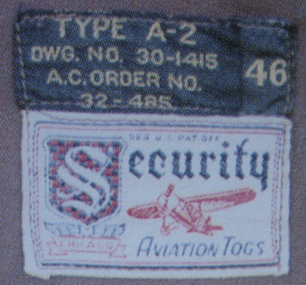
There is also an original A1 with label on the Eastman web site;
https://www.eastmanleather.com/type-contract-31-800p-p-162.html
The zero's and O's appear to be the same font;
There is also an original A1 with label on the Eastman web site;
https://www.eastmanleather.com/type-contract-31-800p-p-162.html
MeachamLake
Well-Known Member
There was a precedence for the bigger right pocket among the early A-1 contracts. Which MFG made it is unknown to me:
View attachment 10612
That photo is so cool. Any more?
2BM2K
Well-Known Member
The photo is from here;
https://airandspace.si.edu/collections/search/equipment?page=5&filter[object_type]=Photographs
https://airandspace.si.edu/collections/search/equipment?page=5&filter[object_type]=Photographs
zoomer
Well-Known Member
The solution to the pocket mystery might be: which makers supplied both A-1s and M-422As? The A version of course had asymmetrical pockets; the early ‘422 did not.
I believe Gordon & Ferguson here in the Twin Cities had at least part of the 31-800P contract - which may have involved multiple firms? I am certain they made ‘422As a decade later.
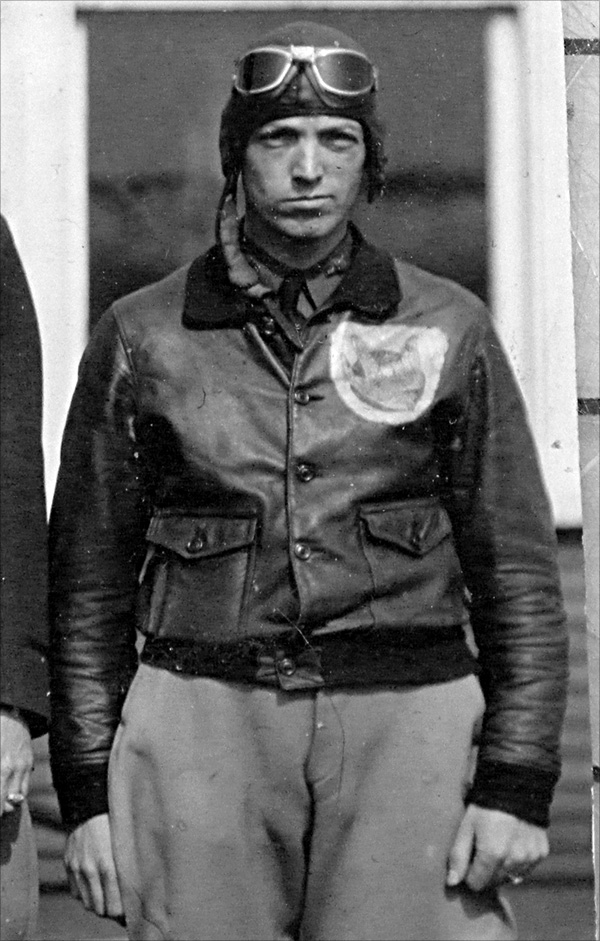
The A-1 with asymmetrical pockets is not an "early" one. It has waist snaps, and lacks the slight angle to the collar edges we see on button-waist examples, like this...
Last edited:
Skyhawk
Well-Known Member
I have some more preliminary photos of our test jacket. There will be a lot of changes coming to this prototype to bring it up to the level of authenticity I am aiming for. A few of the items that I think are looking good are the pocket shape and flap design and the collar. The pattern and the fine details need some work so we will be making up another test jacket to solve those items. I already identified the issues with the hook attachments and the zipper, as well as the windflap. Just some misunderstandings with production. Those are among the changes that will be made so no need to critique those items, I am on the case.
In regards to the labels, we went with the most likely combination that would have been used. The white Goldsmith label was actually used on Goldsmith's clothing items in 1930-31. The black label was never seen in this format or size. They did use a black and gold label on some baseball mitts but the actual label format and size were different. We don't think that they would have made a new label just for this 25 jacket production. If they did by chance use an existing mitt label that was black and gold, or even if they made a label, it would not match the spec label gold color perfectly as has been theorized with the other production. It looks to me like those perfectly matching labels were made at the same time by the same label maker. History has shown that this would have not been the case with the original jacket as the government supplied the Spec Labels.
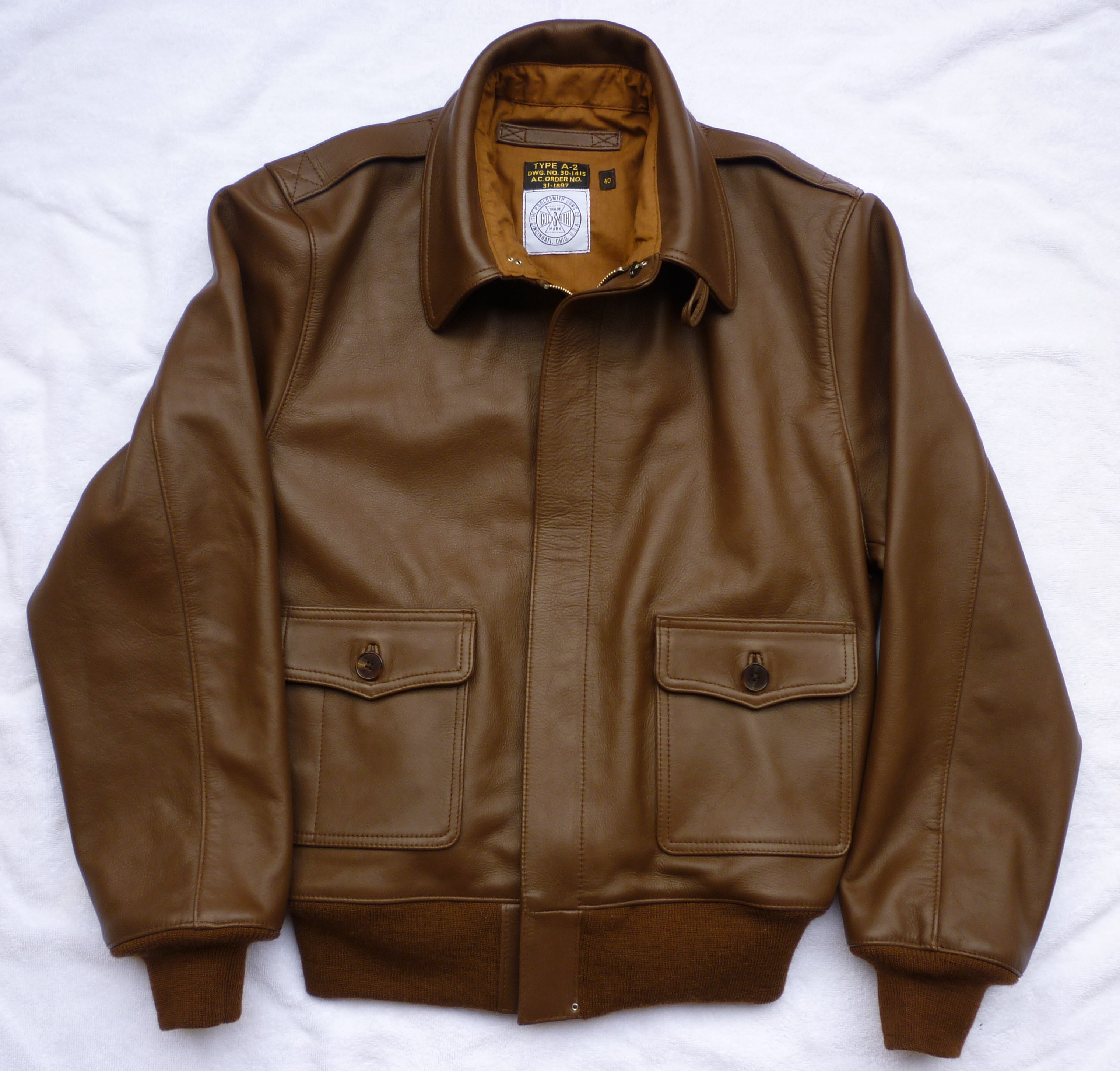
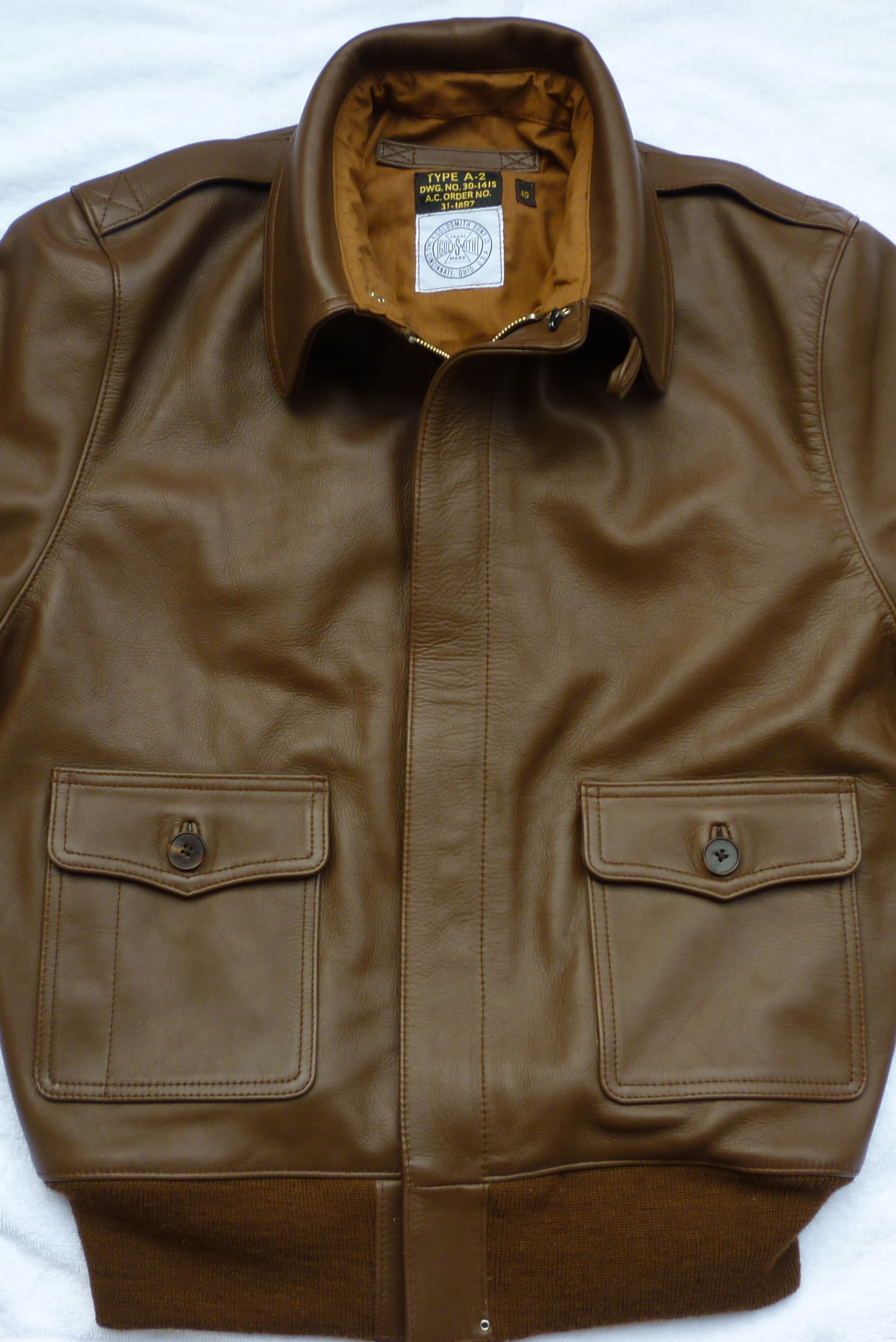
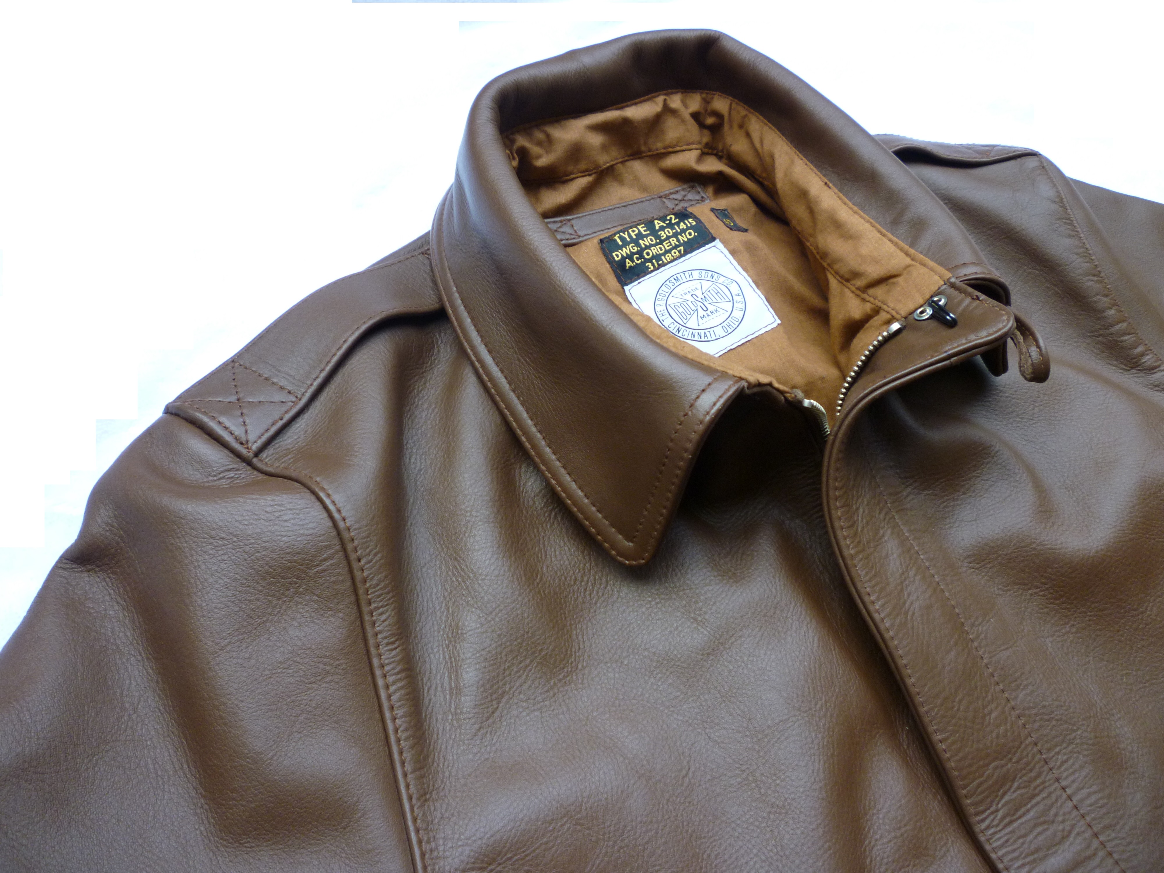
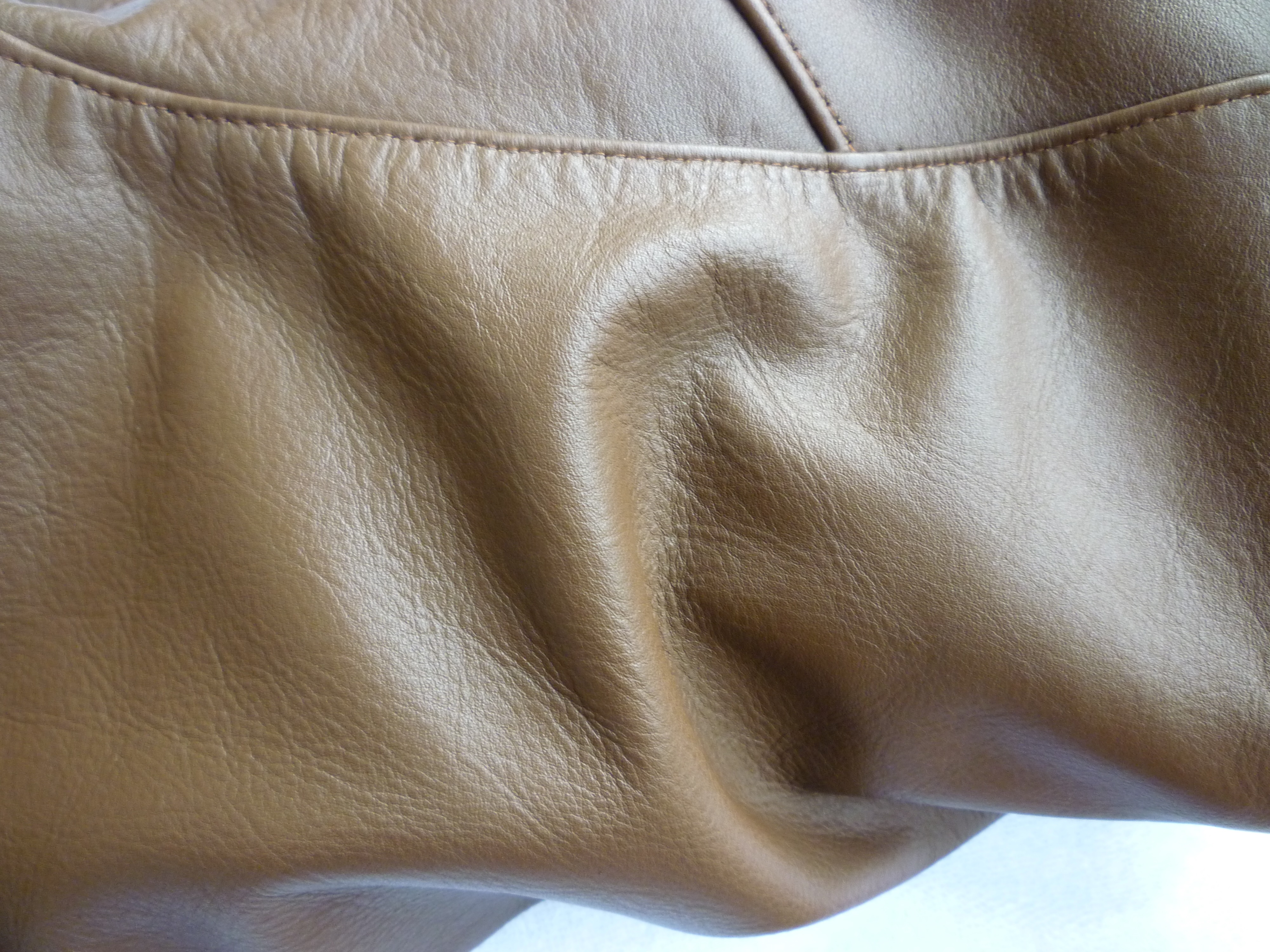
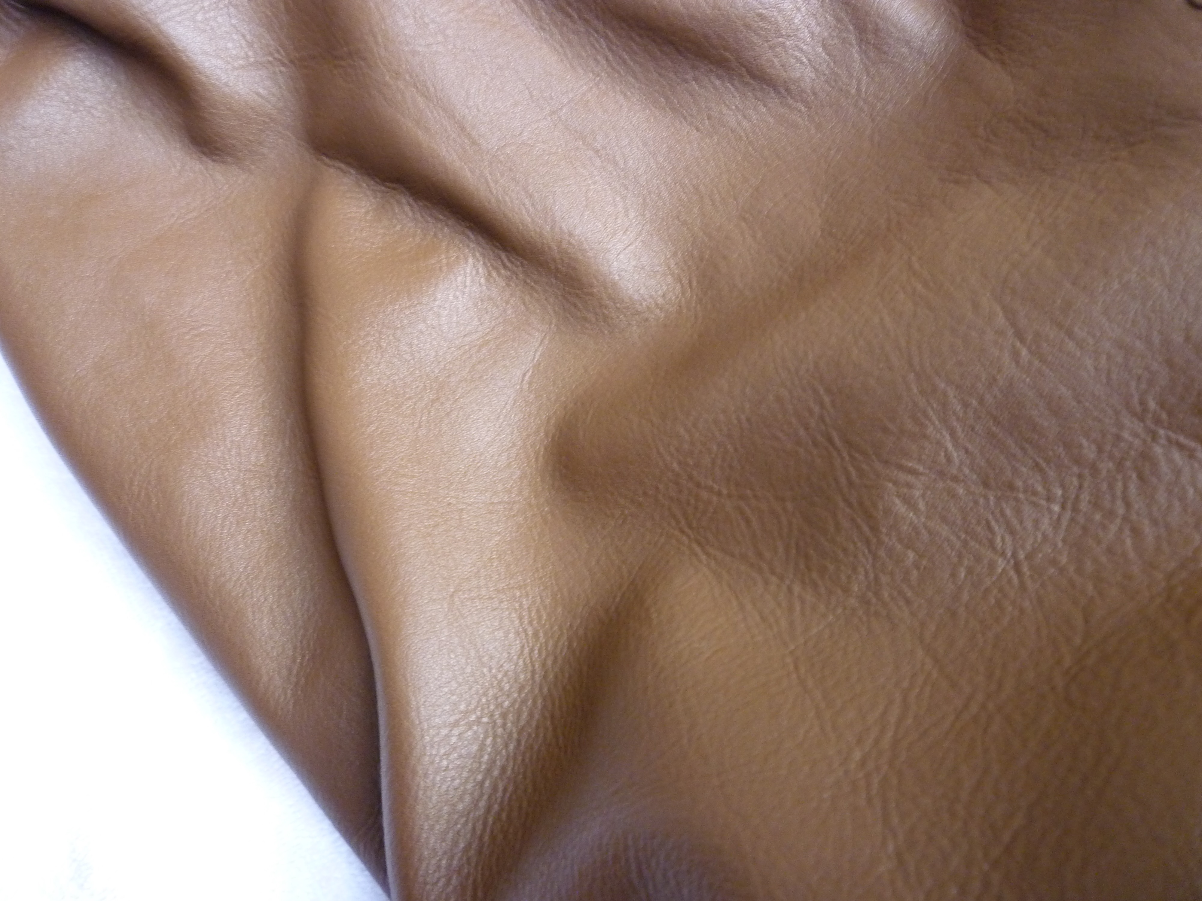
In regards to the labels, we went with the most likely combination that would have been used. The white Goldsmith label was actually used on Goldsmith's clothing items in 1930-31. The black label was never seen in this format or size. They did use a black and gold label on some baseball mitts but the actual label format and size were different. We don't think that they would have made a new label just for this 25 jacket production. If they did by chance use an existing mitt label that was black and gold, or even if they made a label, it would not match the spec label gold color perfectly as has been theorized with the other production. It looks to me like those perfectly matching labels were made at the same time by the same label maker. History has shown that this would have not been the case with the original jacket as the government supplied the Spec Labels.
